Celebr8
Every occasion is worth a celebration
A case study aiming to help our client by creating a new website appealing to its major customer base
Celebr8
A case study aiming to help our client by creating a new website appealing to its major customer base
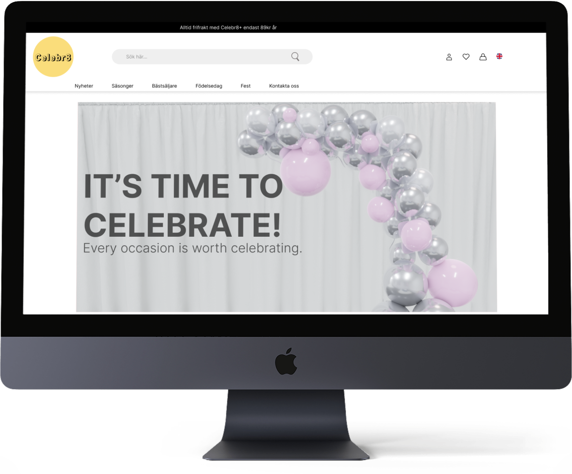
Getting started
The customer approached our school looking for help to improve his internet presence. He owns a web-based retail company that mainly sells party products.
He expressed his desire to create a brand new website. All the current sales are generated through accounts on Cdon and Amazon.
The customer was open to suggestions regarding the graphic design and the name."
Context
The company's current name is very similar to another retailer that sells the same products. It is very hard for customers to distinguish between the two companies because of that.
The client doesn't have direct customers, even if the sales volumes are very hight, the customers purchases thanks to the convenience of finding the products at well known websites

The challenge
It became evident to us that the task was quite extensive, and we had to streamline our focus areas. Prioritization was necessary to ensure the timely delivery of a completed product.
The primary customer demographic for the client comprises women aged 20 to 35.
Create an attractive website that gives a vivid impression and appealing product images
By strengthening and clarifying the brand's visual expression we ensure that it goes hand in hand with the company's values and business goals.
Redirect traffic from websites where they currently exist such as CDON and Fyndig.se to the existing website.
Create a strong graphic profile with a clear link between the website and the delivered product
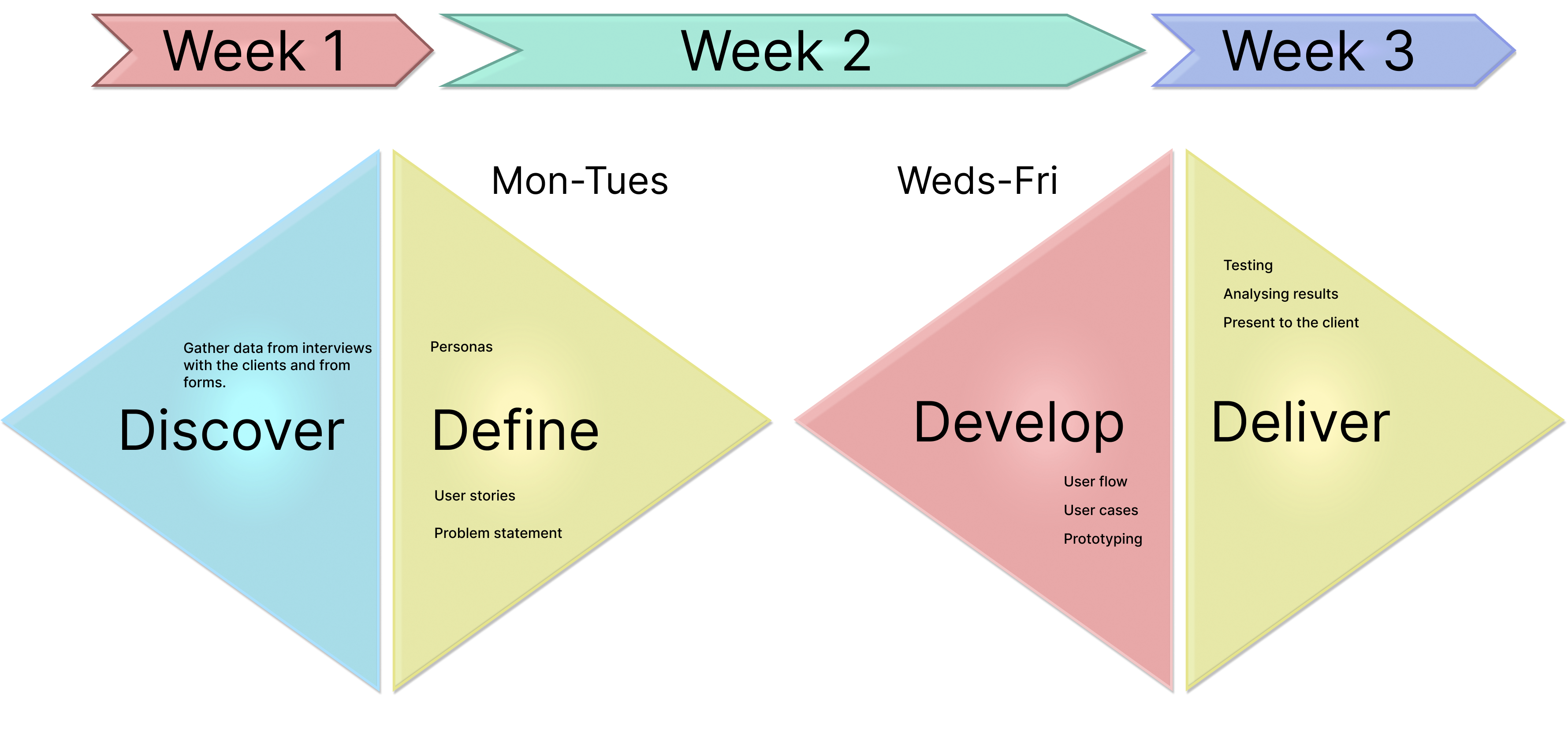
When working on school projects, I often maintain a flexible approach to ensure a broad perspective. Initially, my primary objective was to establish a systematic and structured workflow.
I outlined the project, which involved identifying key activities throughout the entire process. Meanwhile, the other group members had the freedom to determine the execution of their assigned tasks.
.png)


Uncovering the Value of Customer Reviews:
At the project's outset, our objective was to familiarize ourselves with the client to identify key areas where our team could provide added value.
In early surveys, the majority of participants emphasized the crucial role that customer reviews play in their decision-making process. We observed that a visible review section was absent from the prototype page presented by the client. Consequently, we made an early decision to prioritize the integration of this component into our design.
The absence of a visible review section on the client's website represented a missed opportunity to gain insights about their customers. Reviews not only lend legitimacy to potential customers but also encourage previous customers to become brand ambassadors by sharing their product experiences.
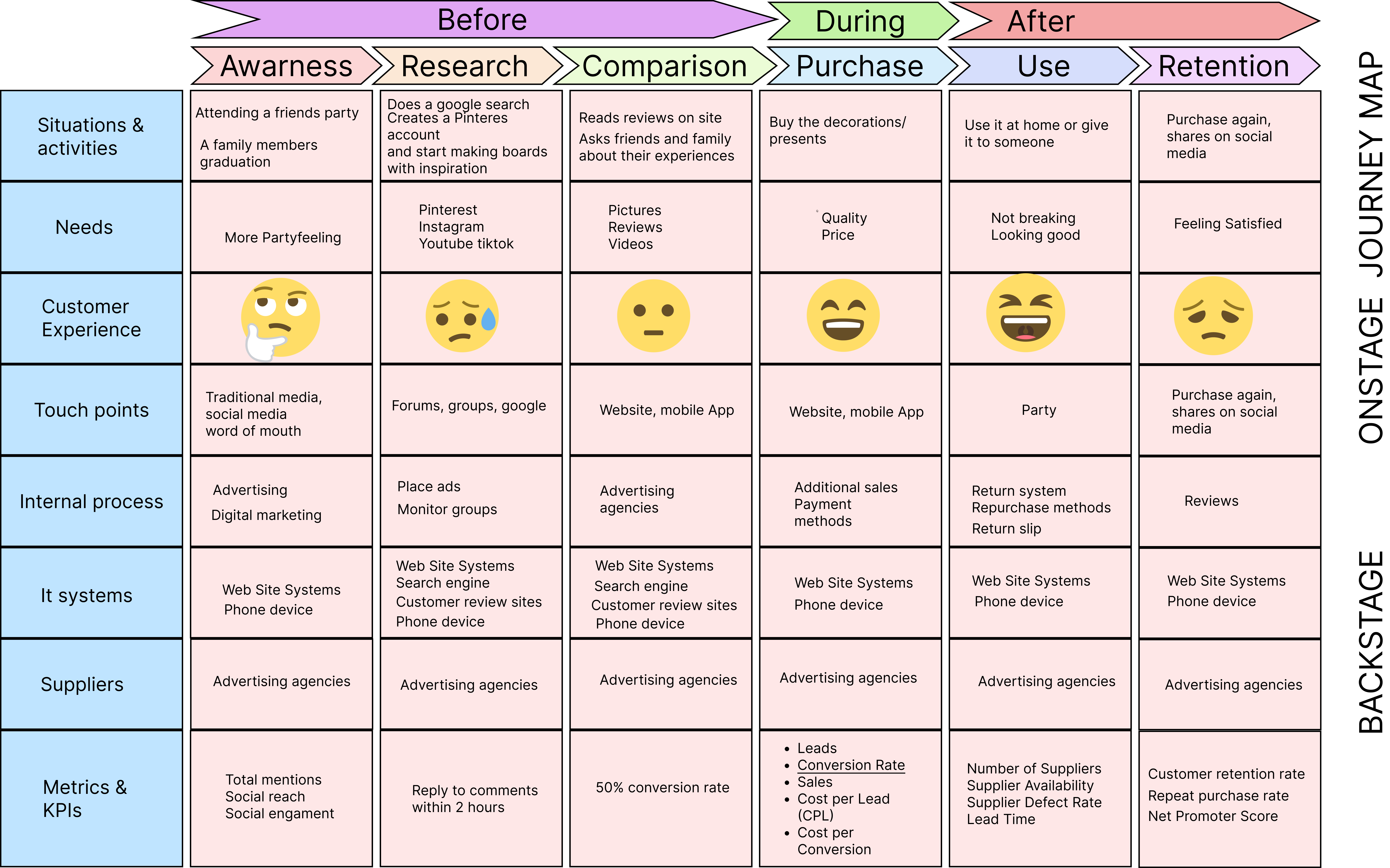
To facilitate our project, we collaborated with all team members to create a summary of the top issues. This served as our starting point, enabling us to identify potential pain points from various perspectives and discover new opportunities.
Competitors
Several other websites in Sweden offer a similar range of products. We discovered that the client purchases some items from competitors, which hampers their ability to offer lower prices and diminishes their chances of being a market leader.
Two of the competitors had well-defined categories designed to inspire potential customers. Out of the four competitors we analyzed, three offered the same prices for similar products, while our client had the same number of items at higher prices and smaller sizes.
User interviews
We designed a Google form with questions aimed at mapping the customer journey, beginning with factors such as purchasing frequency, research habits, product quality, and preferences.
The solution
Drawing from the insights obtained through Analogous Research, Customer Support Requests, and previous research, we have developed the following proposal.
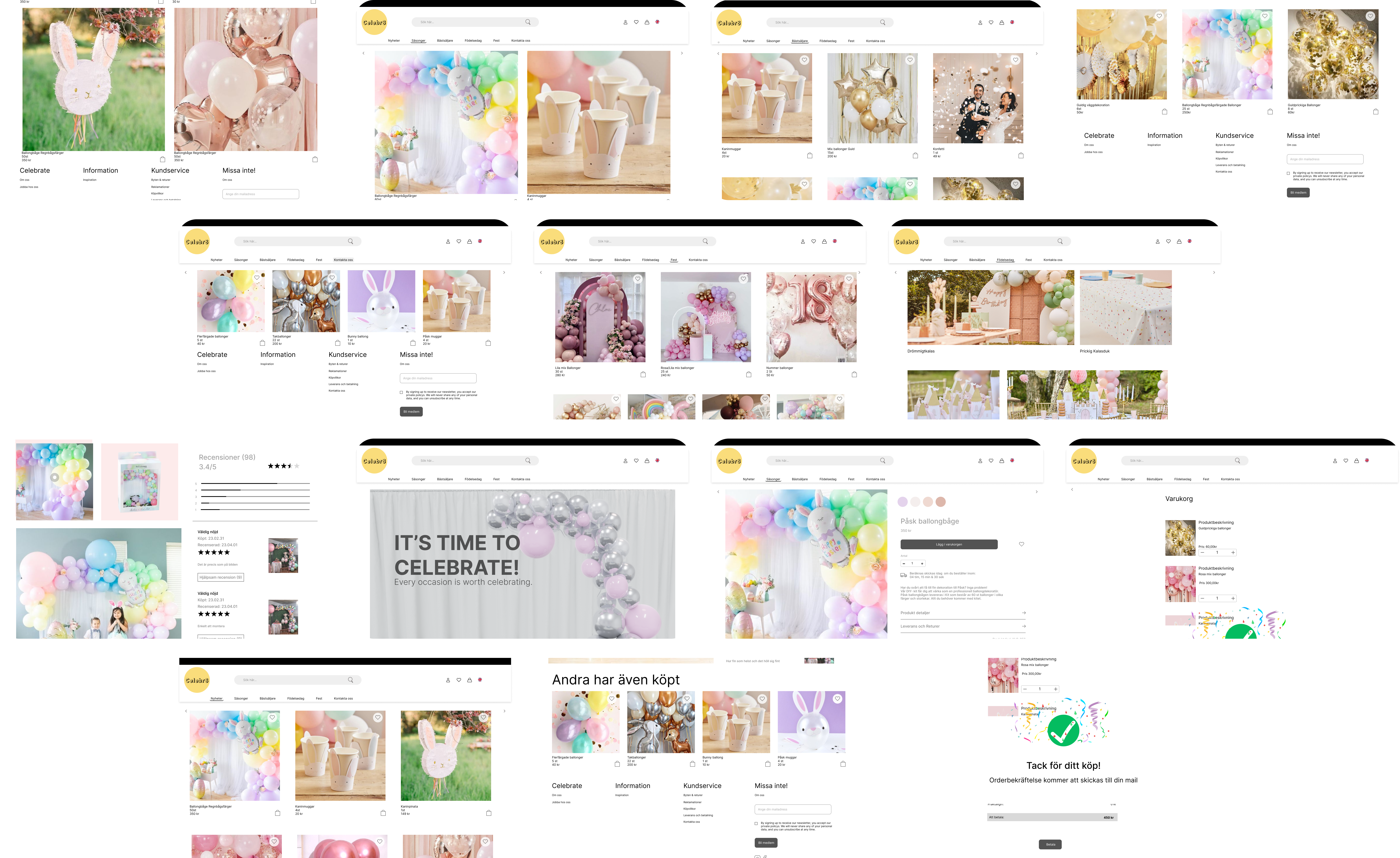
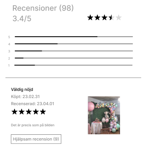
In order to improve the user experience and provide valuable insights to potential customers, we implemented an exciting addition to the product pages—customer reviews. These reviews offer a platform for the customers to share their experiences, opinions, and feedback on the products they've purchased.
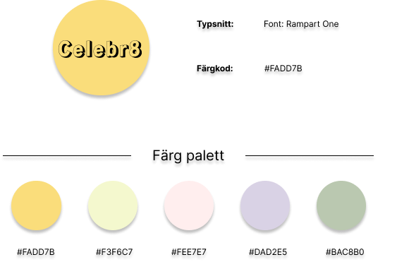
In our ongoing commitment to evolving and enhancing the brand identity, we introduced a new graphic profile. This extensive transformation encompasses a new logo design, carefully selected fonts, and a vibrant color palette that collectively define our brand's visual identity.
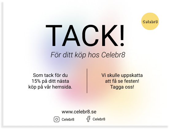
To address the challenge of attracting direct customers, we recommended the inclusion of a heartfelt thank you card within the packaging. This strategic move not only expresses our appreciation for existing customers but also serves as a discreet yet impactful way to introduce them to the new webpage. It is a simple, yet powerful gesture that can foster a deeper connection with the customer base and further enhance the brand's online presence.
To enhance the unboxing experience, we proposed offering an alternative packaging option that would imbue customers with a heightened sense of luxury, acknowledging that the client faces constraints in influencing product prices due to various factors. This thoughtful addition aims to create a memorable and elevated unboxing experience for our valued customers.
 1.png)

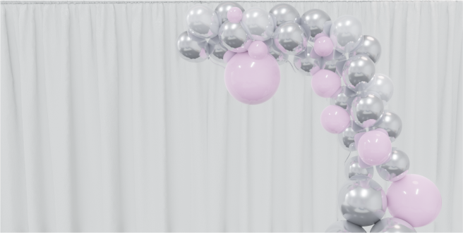
After user testing, we focused on making our prototype more user-friendly. To achieve this, we created new images that significantly improved the overall visual appeal. These enhancements not only enhance the user experience but also contribute to a more engaging and user-friendly design.
Learnings
#1Image Resolution Matters to Users
We received feedback from our user testing sessions where customers expressed irritation when images had low resolutions.
#2 Value of a Well-Defined Process
When it came time for our team to compile the report, it was remarkably easy to review the data and insights we had collected, thanks to our well-defined process.
#3 Varied Customer Preferences
While conducting interviews, we discovered that not everyone prioritizes product quality when it comes to party items. Most of our interviewees showed a greater interest in purchasing the most affordable products rather than emphasizing quality.